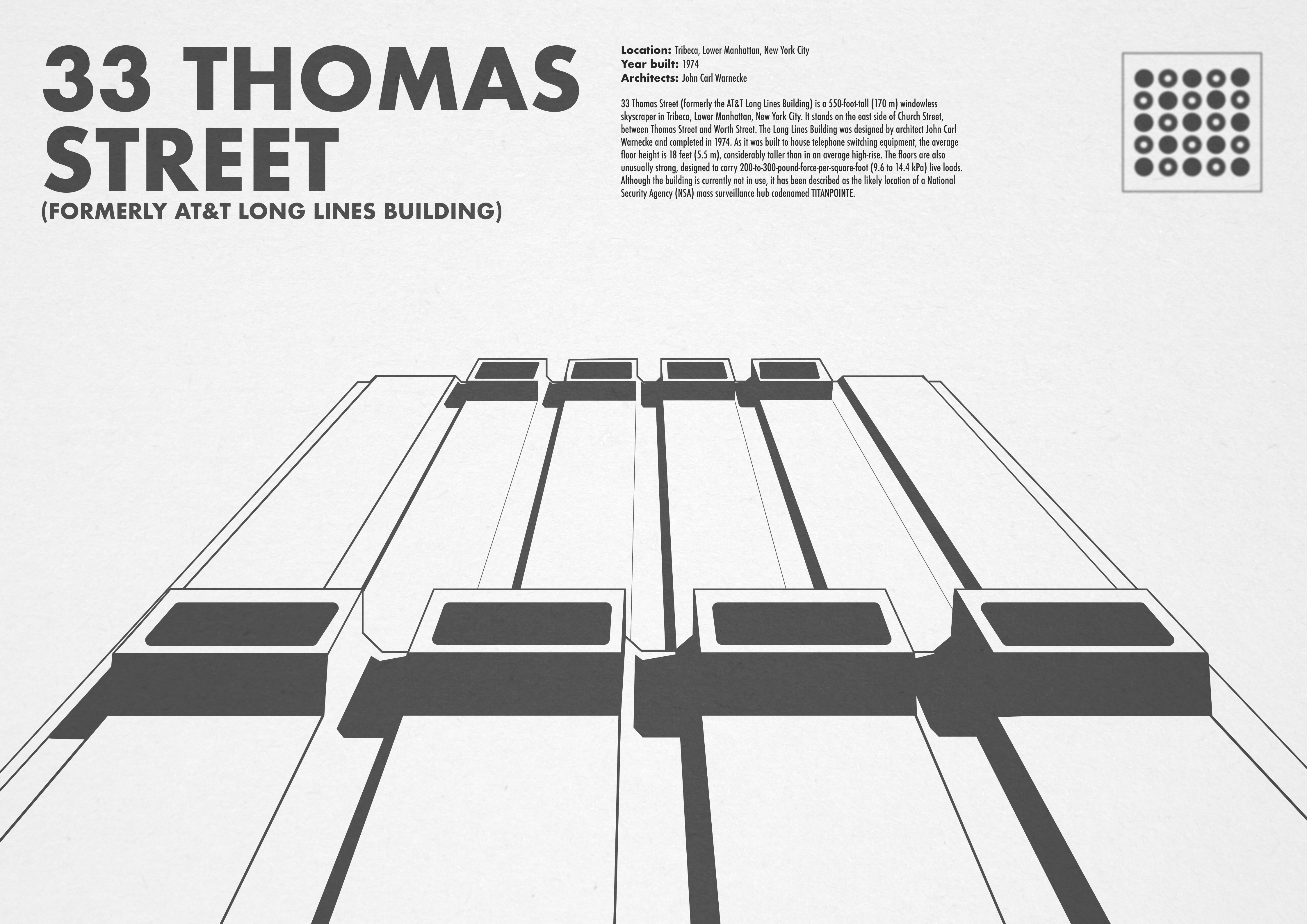
Brutalist Project
Date Created:
April, 2022
Tools Used: Figma
The Brief:
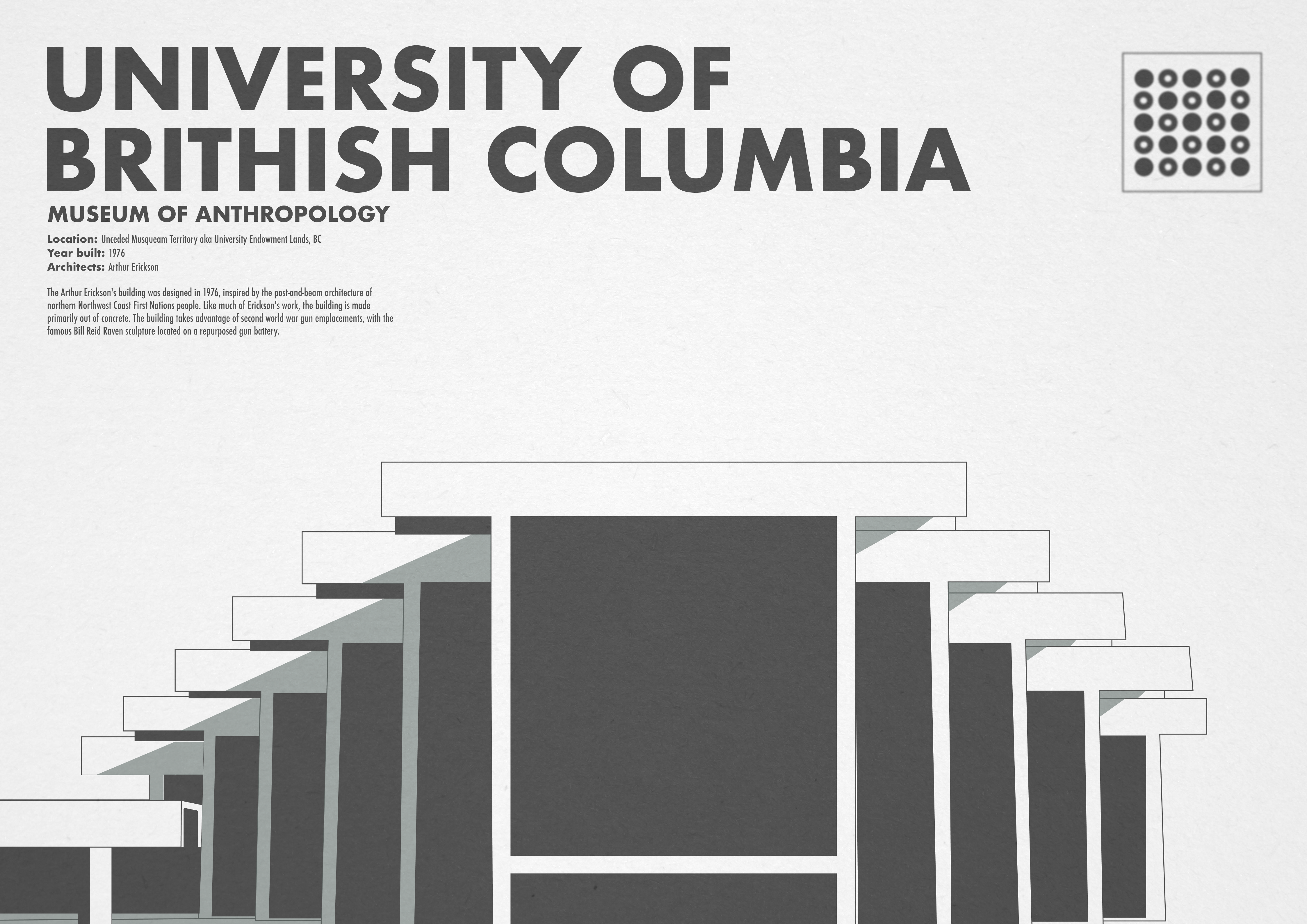
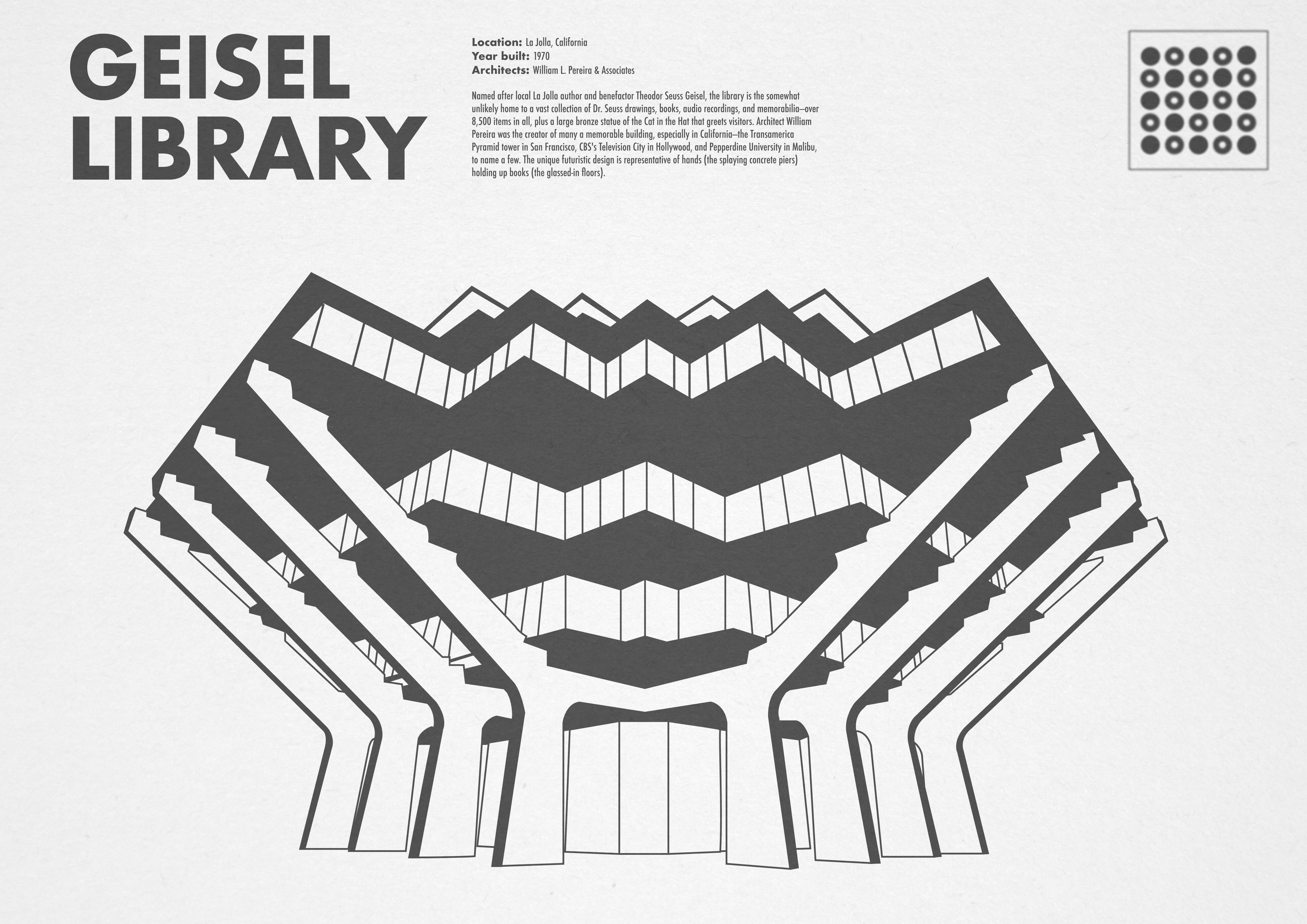
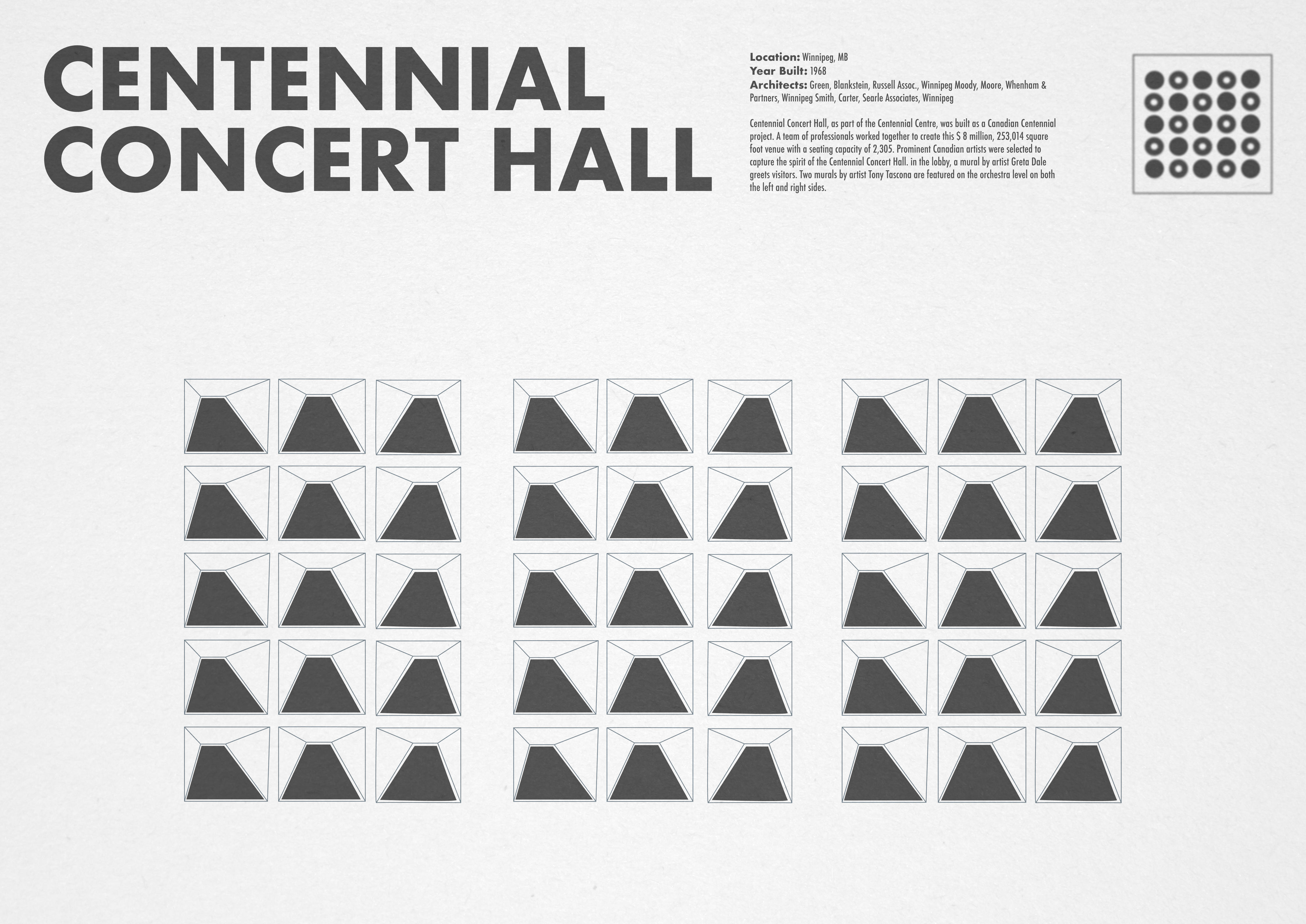
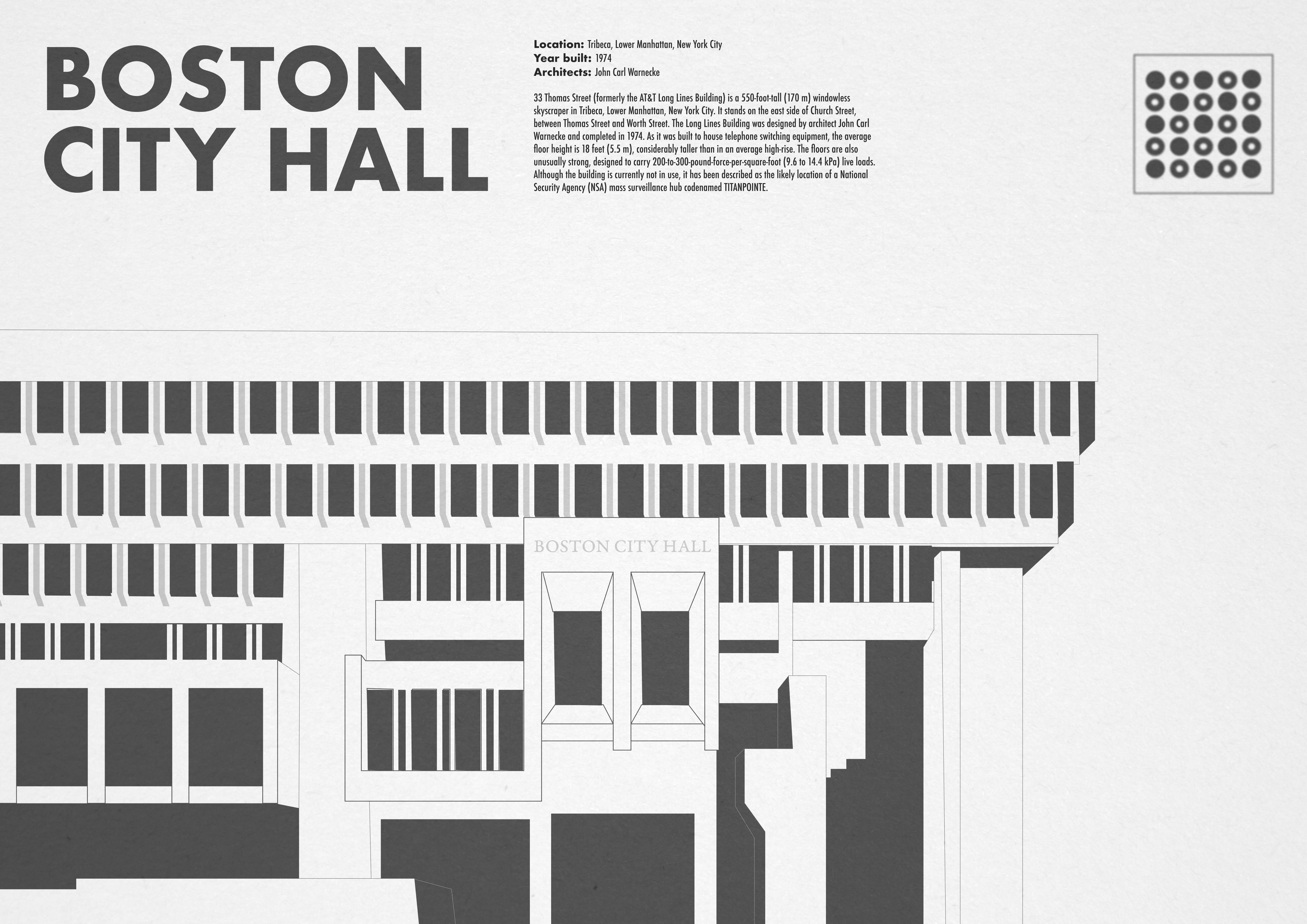
Inspired by a fictitious magazine I created for a school project, I created a series of posters inspired by some of my favourite brutalist architecture. The goal was to create a series of posters with a consistent design language, highlighting the unique characteristics of the various buildings.
The Inspiration:
I’ve always felt that Brutalism gets a bad reputation. With a growing interest in design and it’s history, I thought it would be a rewarding exercise to create a series of posters complete with illustrations and historical context. A practice in both design and design research.
Design Rationale:
Clean lines and a greyscale colour palette felt appropriate for the project. Simple vector drawings help to show the impactful simplicity of the architectural style and keep the series consistent in tone.
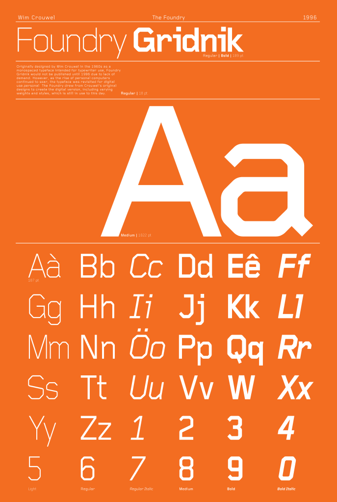
Type Specimen Poster
Date Created:
November, 2021
Tools Used: Adobe Illustrator
The Brief:
Make a 24″x36″ poster for a historical typeface, giving context to its design and designer(s). The type used for the poster must be from the same font family and utilize at least three different weights.
The Typeface:
Foundry Gridnik, officially released in 1996 by The Foundry. This type family was originally designed by Wim Crouwel in the 1960’s as a single weight monospace font for Olivetti typewriters, but due to low demand never saw the light of day. However, as the age of computers boomed, the heavily grid based type found new life years later and was released for wider use.
Design Rationale:
Wim Crouwel was the ‘father of the grid’, which heavily influenced the design process for this poster layout. With a simple contrast between white and a modernist orange, the type has room to express itself at multiple scales.
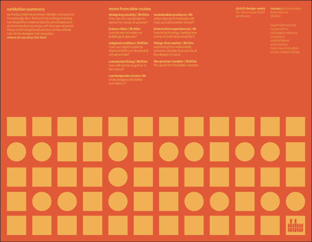
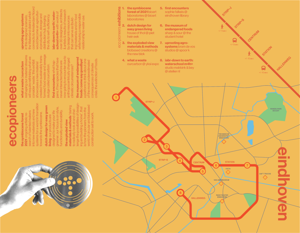
Tri-Fold Brochure
Date Created:
April, 2022
Tools Used: Adobe Indesign
The Brief:
Create a tri-fold brochure for an ongoing festival of your choice. The brochure must include any important dates, events, and a map of the festival location. The brochure should also take into account the design language of the festival.
The Event:
Dutch Design Week 2022. Exhibition: Ecopioneers. 16-24 October, 2022.
Design Rationale:
Dutch Design Week is a world renowned design festival celebrating all that is new and exciting in the world of design. The audience is well versed in design and it’s rich history.
Because of this, I wanted to create a timeless design concept that avoids the trappings of trendy concepts. Something grid-based and typography driven was the jumping off point for the brochure layout. For the front of the brochure I used squares and circles to spell out the festival year, which is only revealed upon fully opening the brochure. For the layout I took inspiration from Otl Aicher’s ’72 Olympics design system. For the map I looked at the subway mapping styles of Massimo Vignelli and the New York City Subway system.
[Extra] Personal Projects
Date Created:
2024–2025
Tools Used: Figma
Included: Various personal projects from the past year. If you’d like to see more process slides, just let me know.
Cole Shway: Custom logo, song artwork, and T-Shirt for Cole Shway’s 2025 single Hey There, Honey.
OddShop: Logo and visual identity proposal for a custom fabrication studio based in Winnipeg, MB.
Rees: Poster series for a friend I made in exchange for some shelves.
Joe’Lympics: Sticker and T-Shirt design for a friends bachelor party.

Leave a comment